Version v3.2.0
Custom Assets
View customization often requires additional style sheets, images, and fonts. Due to same-site security restrictions, it is not possible to reference them from another host. Therefore, all the required assets can be uploaded to ProAuth. Custom assets are managed at different levels, the same as view customizations.
Asset Levels
| Level | Scope | Managed By |
|---|---|---|
| Global | All tenants and subscriptions | SystemAdmin (API only) |
| Subscription | All tenants within a subscription | SubscriptionAdmin |
| Client App | Single client application | TenantAdmin |
| Tenant | Single tenant | TenantAdmin |
Serving Assets
Custom assets are served via the /assets/ endpoint:
GET /assets/{location}The location is the relative path assigned when the asset is created. Assets are served with proper MIME types and ETag headers for browser caching.
Using Custom Assets in Templates
Reference custom assets in your Fluid templates using the asset path. Use context variables to build dynamic paths that automatically resolve to the correct tenant, subscription, or client app:
liquid
{%- comment -%} CSS stylesheet {%- endcomment -%}
<link href="/assets/tenant/{{ tenant_id }}/brand.css" rel="stylesheet" />

{%- comment -%} Images {%- endcomment -%}
<img src="/assets/subscription/{{ subscription_id }}/logo.png" alt="Logo" />

{%- comment -%} JavaScript {%- endcomment -%}
<script src="/assets/tenant/{{ tenant_id }}/custom.js"></script>
Available context variables for building paths:
| Variable | Description |
|---|---|
| Current tenant GUID |
| Current subscription GUID |
| Current client app GUID |
CSS Custom Properties for Theming
The recommended approach for tenant-specific branding is to upload a custom CSS file that overrides ProAuth's CSS custom properties. This allows you to change colors, fonts, and other visual aspects without modifying the Fluid templates.
Available CSS Custom Properties
css
:root {
    /* Primary brand colors */
    --proauth-primary: #0041c8;
    --proauth-primary-hover: #0036a8;
    --proauth-primary-light: #eef3ff;
    --proauth-accent: #0041c8;

    /* Background and text */
    --proauth-bg: #f8f9fc;
    --proauth-card-bg: #ffffff;
    --proauth-text: #0f172a;
    --proauth-text-muted: #64748b;

    /* Form inputs */
    --proauth-input-border: #d1d5db;
    --proauth-input-focus: #0041c8;

    /* Status colors */
    --proauth-error: #dc2626;
    --proauth-success: #16a34a;
    --proauth-warning: #d97706;
    --proauth-info: #2563eb;

    /* Typography */
    --proauth-font-family: 'Plus Jakarta Sans', sans-serif;

    /* Border radius */
    --proauth-input-radius: 0.5rem;
    --proauth-button-radius: 0.5rem;

    /* Brand panel gradient (desktop) */
    --proauth-brand-gradient-from: #0041c8;
    --proauth-brand-gradient-to: #001a57;

    /* Logo images */
    --proauth-logo-url: url('/images/logo.svg');
    --proauth-logo-sm-url: url('/images/logo-name.svg');
}
For the complete list and usage examples, see Auth View Customization — CSS Custom Properties.
Example: Custom Branding CSS
- Create a CSS file with your custom properties:
css
/* custom-brand.css */
:root {
    --proauth-primary: #e11d48;
    --proauth-primary-hover: #be123c;
    --proauth-primary-light: #fef2f2;
    --proauth-bg: #fffbeb;
    --proauth-text: #1c1917;
    --proauth-font-family: 'Inter', sans-serif;
    --proauth-brand-gradient-from: #e11d48;
    --proauth-brand-gradient-to: #881337;
}
Upload
custom-brand.cssas a custom asset at the tenant level.Create a custom
Shared/_Head.liquidpartial at the same tenant level to include both the default stylesheet and your custom one:
liquid
<link rel="preconnect" href="https://fonts.googleapis.com" />
<link rel="preconnect" href="https://fonts.gstatic.com" crossorigin />
<link href="https://fonts.googleapis.com/css2?family=Inter:wght@400;500;600;700&display=swap"
      rel="stylesheet" />
<link href="/dist/css/main.css" rel="stylesheet" />
<link href="/assets/tenant/{{ tenant_id }}/custom-brand.css" rel="stylesheet" />
Overriding _Head.liquid
The default _Layout.liquid uses {% include '_Head' %} to load CSS and fonts. Because the {% include %} tag respects the customization hierarchy, creating a custom _Head.liquid at the tenant level automatically overrides the default — even without changing the layout. This is the recommended approach for CSS-only customizations.
Supported Asset Types
Any file type can be uploaded. Common types include:
| Type | Example Extensions | MIME Type |
|---|---|---|
| CSS | .css | text/css |
| JavaScript | .js | application/javascript |
| Images | .png, .jpg, .svg, .ico | image/png, image/jpeg, image/svg+xml |
| Fonts | .woff2, .woff, .ttf | font/woff2, font/woff, font/ttf |
Create new custom asset
Steps to create a new custom asset:
Navigate to the ProAuth Admin UI and authenticate with a user with is at least a
TenantAdminNavigate to
Admin Settings, then toAssetsand click onCreate asset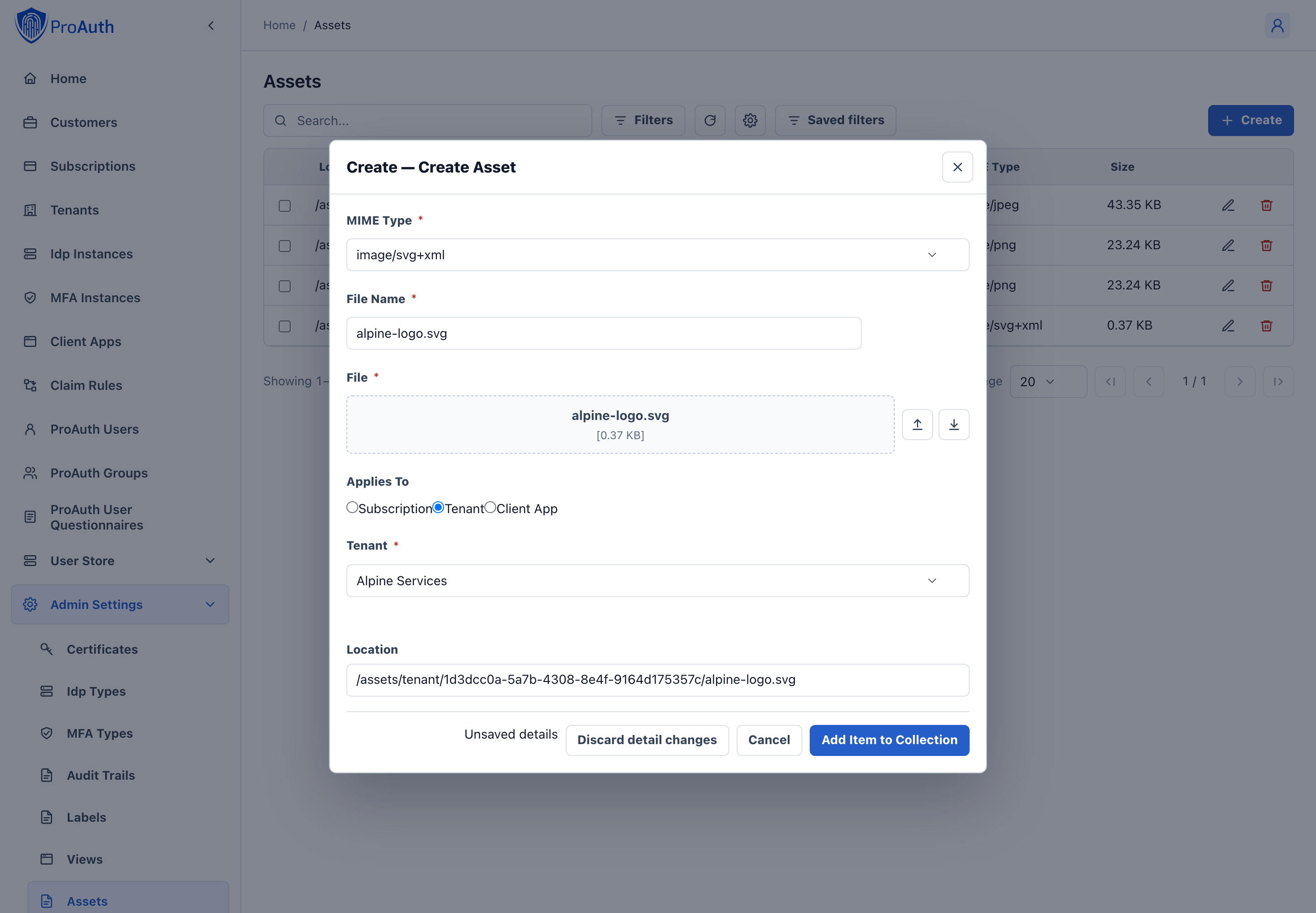
Choose "upload" to upload a file via a file dialog or drag and drop a file to the corresponding area.
Verify the mime type and the filename. The dialog automatically sets the filename and mime type according to the uploaded file.
Select the level to which you want to associate the asset. The chosen level with the corresponding id will be part of the path.
- Subscription
- ClientApp
- Tenant
Click
Save
The location field shows the fully qualified relative path of the asset. This path is used to reference it from the customized views.
Edit custom assets
Existing custom assets can be updated / modified as long as the mime type is not change respective as long as the updated content matches the existing mime type.
Depending on the mime type, the custom asset is either shown in the text editor with syntax highlighting or as a preview rendering if it is an image. Other binary content will not be rendered in the preview.
The custom asset can always be updated by uploading a new version of the file by using the file upload dialog or by dragging and dropping the file to the corresponding area.
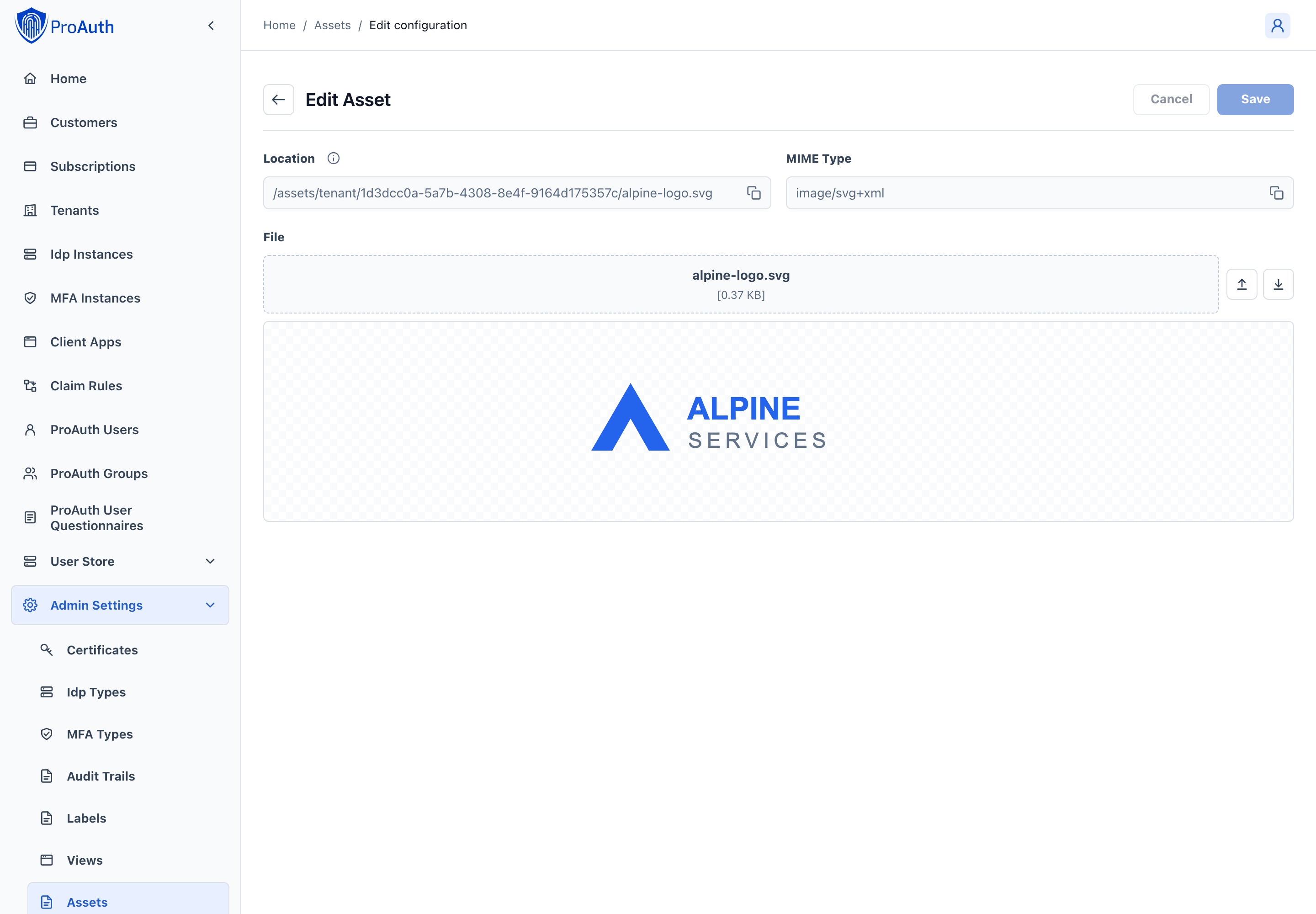
The location field shows the fully qualified relative URL. This relative URL is used to reference the asset in your customized views.
After replacing an asset, save and reload the page to verify the persisted content. The v2 API reports size from the stored bytes and fileName from the asset location; these are derived values, not editable metadata. Downloading the saved asset returns those stored bytes.