Version v3.2.0
Auth View Customization
Every authentication view in ProAuth can be customized using Fluid (Liquid) templates. Customizations range from simple CSS branding to fully redesigned authentication flows.
Default Authentication Wording
The default views use task-focused labels: Choose how to sign in for provider selection, Sign In for the credential form, Verify your identity for verification codes, Set up two-step verification for MFA setup, and Complete your details for the user questionnaire. The brand slogan is Secure access to your applications.
Provider selection shows Continue to {application name} when an application name is available. It does not show tenant information. Provider buttons use the localized /authviews/signin-continue-with-provider label (Continue with {0}), with the configured IdP instance name as {0}. Choose names users recognize, such as Employee account or Customer account. Names are rendered as configured; tenant wording included in an instance name must be removed from that configuration.
The credential, password, and MFA headings omit instance names by default. The existing model.InstanceName and model.MfaName values remain available to custom templates and title labels. On the provider selection view, customers can restore tenant context using the existing model and label:
liquid
{% if model.TenantName != blank %}
    {% auth_title key: 'layout-title-tenant', v0: model.TenantName, v1: model.ClientAppName,
                  tag: 'p', class: 'proauth-view-subtitle', html: true %}
{% endif %}
All of these labels, including passkey setup status messages, are available in English, German, French, Italian, and Dutch. During initialization, invariant defaults are refreshed. Localized values matching the previous shipped defaults are upgraded; customer-edited localized values are preserved. Existing custom templates continue to take precedence over the default views.
How It Works
ProAuth resolves templates using a priority-based hierarchy. Custom views stored in the database take precedence over built-in defaults. Templates are rendered by the Fluid engine — a secure Liquid template engine that prevents arbitrary code execution.
Customization Levels
Custom views can be scoped to different levels. The view resolver checks each level top-down and uses the first match:
| Priority | Level | Path Pattern | Scope |
|---|---|---|---|
| 1 (highest) | Tenant | /Views/tenant/{tenantId}/... | Single tenant |
| 2 | Client App | /Views/app/{clientAppId}/... | Single client application |
| 3 | Subscription | /Views/subscription/{subscriptionId}/... | All tenants in a subscription |
| 4 (lowest) | Default | /Views/... | Built-in fallback (on disk) |
For each level, the resolver checks both the controller-specific path and the Shared/ path:
/Views/tenant/{tenantId}/{Controller}/{ViewName}.liquid
/Views/tenant/{tenantId}/Shared/{ViewName}.liquid
/Views/app/{clientAppId}/{Controller}/{ViewName}.liquid
/Views/app/{clientAppId}/Shared/{ViewName}.liquid
/Views/subscription/{subscriptionId}/{Controller}/{ViewName}.liquid
/Views/subscription/{subscriptionId}/Shared/{ViewName}.liquid
/Views/{Controller}/{ViewName}.liquid          ← default (disk)
/Views/Shared/{ViewName}.liquid                ← default (disk)
INFO
The {% include %} tag also respects this hierarchy. A custom _Head.liquid partial at the tenant level overrides the default one — even when included from the default _Layout.liquid.
Available Views
The following views can be customized:
Layout & Shared
| View | Path | Description |
|---|---|---|
| Layout | Shared/_Layout.liquid | Master layout — HTML structure, brand panel, header, footer |
| Head | Shared/_Head.liquid | Head element — fonts, icons, CSS references |
| IdP Selection | Shared/SelectIdpInstance.liquid | Identity provider selection page |
| Consent | Shared/Authorize.liquid | OAuth consent / authorization page |
| Logout | Shared/Logout.liquid | Logout confirmation |
| Sign Out | Shared/SignOut.liquid | Sign-out success page |
| Error | Shared/Error.liquid | OIDC error display |
| User Questionnaire | Shared/UserQuestionnaire.liquid | Profile questionnaire form |
User Store (Login & Password)
| View | Path | Description |
|---|---|---|
| Login | UserStore/Login.liquid | Username/password login form |
| Change Password | UserStore/ChangePassword.liquid | Password change form |
| Password Reset Request | UserStore/PasswordResetRequest.liquid | "Forgot password" request form |
| Password Reset | UserStore/PasswordReset.liquid | Password reset form (from email link) |
| Confirm Changed Password | UserStore/ConfirmChangedPassword.liquid | Password change confirmation |
| UserStore Error | UserStore/Error.liquid | UserStore-specific error page |
| Email Verification Confirm | EmailVerification/Confirm.liquid | Email address verification confirmation page |
| Email Verification Error | EmailVerification/Error.liquid | Email address verification failure page |
Multi-Factor Authentication (MFA)
| View | Path | Description |
|---|---|---|
| Verification | Mfa/Verification.liquid | MFA code verification during login |
| Setup | Mfa/Setup.liquid | MFA enrollment (QR code + verification) |
| Confirmation | Mfa/Confirmation.liquid | MFA setup confirmation |
| Recovery Codes | Mfa/RecoveryCodes.liquid | Recovery code display |
| Recovery Verification | Mfa/RecoveryVerification.liquid | Recovery code input |
Email Templates
| View | Path | Description |
|---|---|---|
| Email Layout | EmailTemplates/_EmailTemplateLayout.liquid | Email master layout |
| User Invitation | EmailTemplates/ProAuthUserInvitation.liquid | Invitation email |
| Email Verification | EmailTemplates/UserEmailVerification.liquid | User email address verification email |
| Password Reset | EmailTemplates/UserStoreResetPassword.liquid | Password reset email |
| Account Locked | EmailTemplates/UserStoreLockedUser.liquid | Account locked notification |
| MFA Code | EmailTemplates/MfaEmail.liquid | MFA code email |
Email templates are rendered with the target user's standard locale profile value when it is configured. The value should be a BCP 47/RFC 5646 language tag such as en-US, de-CH, or fr-CA; underscore input such as de_CH is accepted as de-CH. The same value is exposed through the v2 Locale fields on User Store users and ProAuth users and maps to the OIDC locale claim. If the user locale is empty or invalid, ProAuth falls back to the email-specific culture option where one exists, then to the current request culture, and finally to the label service default culture.
Fluid Template Syntax
ProAuth uses Fluid, a secure Liquid template engine. Templates combine standard Liquid syntax with ProAuth-specific building block tags.
Template Structure
Every view template follows this pattern:
liquid
{% layout '_Layout' %}

{% section 'scripts' %}
    {% validation_scripts %}
{% endsection %}

<div class="proauth-view-header">
    {% auth_title key: 'my-title-key', tag: 'h1', class: 'proauth-view-title' %}
</div>

{% auth_form controller: 'userstore', action: 'login', method: 'post' %}
    {% auth_flow_id %}
    <!-- form fields here -->
    {% submit_button key: 'my-submit-key' %}
{% endauth_form %}
Standard Liquid Features
All standard Liquid features are available:
liquid
{%- comment -%} Conditional rendering {%- endcomment -%}
{% if model.HasError %}
    <p class="text-red-600">An error occurred.</p>
{% endif %}

{%- comment -%} Loops {%- endcomment -%}
{% for item in model.Items %}
    <li>{{ item.Name | escape }}</li>
{% endfor %}

{%- comment -%} Output with filters {%- endcomment -%}
<p>{{ model.LoginName | escape }}</p>
<p>{{ model.CreatedAt | date: "%Y-%m-%d" }}</p>

{%- comment -%} Variable assignment {%- endcomment -%}
{% assign greeting = "Welcome" %}
<h2>{{ greeting }}</h2>
Template Context Variables
These variables are available in every template:
| Variable | Type | Description |
|---|---|---|
model | Object | The view model — properties vary by view (see View Models) |
tenant_id | String | Current tenant ID (GUID) |
subscription_id | String | Current subscription ID (GUID) |
client_app_id | String | Current client app ID (GUID) |
current_year | String | Current year (e.g., "2026") |
Use these to build dynamic asset paths:
liquid
<link href="/assets/tenant/{{ tenant_id }}/custom-brand.css" rel="stylesheet" />
<img src="/assets/subscription/{{ subscription_id }}/logo.png" alt="Logo" />
Security
Templates cannot execute arbitrary .NET code. All rendering logic is provided through the building block tags listed below. This ensures that custom views cannot compromise the security of the authentication flow.
Building Block Tags Reference
Tags use named parameters with the syntax parameter: value. Parameters are separated by commas.
Layout & Structure
{% layout 'name' %}
Declares the parent layout template. Must be the first tag in a view.
liquid
{% layout '_Layout' %}{% renderbody %}
Renders the child template's content. Used in layout templates only.
liquid
<main>{% renderbody %}</main>{% section 'name' %}...{% endsection %}
Defines a named content section that a layout can render.
liquid
{% section 'scripts' %}
    {% validation_scripts %}
    {% captcha_scripts %}
{% endsection %}

{% section 'head' %}
    <link href="/assets/custom.css" rel="stylesheet" />
{% endsection %}
{% rendersection 'name' %}
Renders a named section defined by a child template. Used in layout templates.
liquid
<head>
    {% include '_Head' %}
    {% rendersection 'head' %}
</head>
{% include 'name' %}
Includes a partial template. Respects the full customization hierarchy — a custom partial at the tenant level will override the default one. Maximum nesting depth: 5 levels.
liquid
{% include '_Head' %}
{% include '_CustomFooter' %}
Forms & Input
{% auth_form %}
Renders an HTML <form> with automatic anti-forgery token injection.
| Parameter | Required | Description |
|---|---|---|
controller | Yes | Controller name (e.g., 'userstore', 'mfa') |
action | Yes | Action name (e.g., 'login', 'verification') |
method | No | HTTP method (default: 'post') |
class | No | CSS class |
id | No | HTML id attribute |
enctype | No | Form encoding type |
liquid
{% auth_form controller: 'userstore', action: 'login', method: 'post' %}
    {% auth_flow_id %}
    <!-- form fields -->
{% endauth_form %}
{% auth_flow_id %}
Renders the hidden field for the server-side auth flow session. Must be placed inside every {% auth_form %}.
liquid
{% auth_flow_id %}Renders: <input type="hidden" name="__flowId" value="..." />
{% text_input %}
Renders a labeled text input field.
| Parameter | Required | Description |
|---|---|---|
for | Yes | Model property name (e.g., 'LoginName') |
label_key | No | Label key for localization |
placeholder_key | No | Placeholder label key |
type | No | Input type (default: 'text') |
autofocus | No | Auto-focus on page load |
autocomplete | No | Browser autocomplete hint |
required | No | HTML required attribute |
class | No | CSS class |
name | No | Override input name |
value | No | Override input value |
id | No | Override input id |
liquid
{% text_input for: 'LoginName',
              label_key: 'userlogin-username-input-placeholder',
              autofocus: true,
              autocomplete: 'username',
              required: true %}
{% password_input %}
Renders a password input with optional show/hide toggle.
| Parameter | Required | Description |
|---|---|---|
for | No | Model property name (default: 'Password') |
label_key | No | Label key for localization |
placeholder | No | Placeholder text |
show_toggle | No | Show/hide password button (default: true) |
autocomplete | No | Browser autocomplete hint |
class | No | CSS class |
required | No | HTML required attribute |
liquid
{% password_input for: 'Password',
                  label_key: 'userlogin-password-input-placeholder',
                  show_toggle: true,
                  autocomplete: 'current-password',
                  required: true %}
{% checkbox %}
Renders a checkbox input with label.
| Parameter | Required | Description |
|---|---|---|
for | Yes | Model property name |
label_key | No | Label key for localization |
class | No | CSS class |
liquid
{% checkbox for: 'PasswordChangeRequested',
            label_key: 'userlogin-request-change-pw' %}
{% submit_button %}
Renders a submit button with a built-in loading spinner.
| Parameter | Required | Description |
|---|---|---|
key | Yes | Label key for button text |
id | No | HTML id attribute |
class | No | CSS class (default: 'proauth-btn proauth-btn-primary w-full') |
liquid
{% submit_button key: 'userlogin-sign-in', id: 'btn-signin' %}{% password_strength %}
Renders a password strength meter that responds to user input.
| Parameter | Required | Description |
|---|---|---|
for | No | Field name to monitor (default: 'Password') |
id | No | HTML id attribute |
liquid
{% password_strength for: 'PasswordNew' %}{% validation_summary %}
Renders a container for client-side validation error messages. No parameters.
liquid
{% validation_summary %}{% validation_scripts %}
Compatibility tag for older/custom templates. The shared layout loads /dist/js/app.js once, which contains client-side validation and form behavior.
liquid
{% section 'scripts' %}
    {% validation_scripts %}
{% endsection %}
Text & Localization
{% auth_title %}
Renders a localized heading or text element.
| Parameter | Required | Description |
|---|---|---|
key | Yes | Label key for localization |
variables | No | Comma-separated variable substitution values, or use v0:, v1: for indexed values |
tag | No | HTML tag name (default: 'h2'). Use 'p', 'span', 'h1'–'h6' |
class | No | CSS class |
liquid
{%- comment -%} Simple title {%- endcomment -%}
{% auth_title key: 'userlogin-title', tag: 'h1', class: 'proauth-view-title' %}

{%- comment -%} With variable substitution {%- endcomment -%}
{% auth_title key: 'layout-title-tenant', v0: model.TenantName,
             v1: model.ClientAppName, tag: 'p', class: 'proauth-view-subtitle' %}

{%- comment -%} Footer copyright with year {%- endcomment -%}
{% auth_title key: 'layout-footer-copyright', variables: current_year, tag: 'span' %}
{% auth_link_text %}
Renders localized text that can contain safe anchor links. This tag is opt-in: ordinary labels and {% auth_title %} remain HTML-encoded. The label may contain plain text and <a href="...">link text</a> elements. Anchor output is reconstructed from an allowlist; all attributes other than a safe href are discarded, nested markup becomes plain text, and unsupported elements are displayed as encoded text. HTTP(S), application-relative, query, and fragment URLs are supported.
| Parameter | Required | Description |
|---|---|---|
key | Yes | Label key containing text and anchor elements |
tag | No | Inline-mode wrapper tag (default: 'p') |
class | No | Wrapper class, or the <ul> class in list mode |
id | No | Wrapper ID |
link_class | No | Class applied to reconstructed anchors |
target | No | Set to _blank to add target="_blank" and rel="noopener noreferrer" |
list | No | When true, renders each top-level anchor as a separate <li> and omits surrounding label text |
item_class | No | Class applied to list items when list: true |
liquid
{%- comment -%} Preserve the complete localized sentence and its links {%- endcomment -%}
{% auth_link_text key: 'mfaregistration-secret-app',
                  class: 'proauth-view-subtitle', target: '_blank' %}

{%- comment -%} For a links-only label, render one bullet per anchor {%- endcomment -%}
{% auth_title key: 'authenticator-app-intro', tag: 'p' %}
{% auth_link_text key: 'authenticator-app-links', list: true,
                  class: 'authenticator-app-list', target: '_blank' %}
List-mode link text should contain a complete accessible name, such as Microsoft Authenticator, rather than a platform-only name such as Android.
{% link %}
Renders a localized anchor link. If the href resolves to empty, renders as muted text instead.
| Parameter | Required | Description |
|---|---|---|
key | Yes | Label key for link text |
href | No | URL or model property for the link target |
href_property | No | Model property name to use as href |
class | No | CSS class |
variables | No | Label variable substitution |
liquid
{% link key: 'userlogin-forgot-pw', href: model.PasswordResetRequestUrl %}
{% link key: 'mfacode-resend-code', href: model.MfaResendUrl %}
UI Components
{% error_info_block %}
Renders error and info messages from the model. Automatically checks model.HasError and model.HasInfo. No parameters.
liquid
{% error_info_block %}{% alert %}
Renders a styled alert message.
| Parameter | Required | Description |
|---|---|---|
type | Yes | Alert type: 'error', 'success', 'warning', 'info' |
key | No | Label key for alert message |
text | No | Direct text (if not using a label key) |
liquid
{% alert type: 'info', key: 'mfacode-sent-confirmation' %}
{% alert type: 'warning', text: 'Please complete all required fields.' %}
{% icon %}
Renders an inline SVG icon.
| Parameter | Required | Description |
|---|---|---|
name | Yes | Icon name |
class | No | CSS class (default: 'proauth-icon') |
Available icons: lock, shield, user, key, mail, check, warning, error, eye, eye-off, logout, settings
liquid
{% icon name: 'lock' %}
{% icon name: 'shield', class: 'proauth-view-icon' %}
{% idp_button_list %}
Renders the list of available identity provider buttons as Continue with {IdpInstanceName}. Reads from model.AuthenticationSchemes and resolves signin-continue-with-provider through the label service. Configured names are HTML-encoded and preserved, including punctuation. No parameters.
liquid
{% idp_button_list %}{% language_selector %}
Renders a dropdown language switcher. Automatically detects available languages from the server configuration. No parameters.
liquid
{% language_selector %}{% qr_code %}
Renders a QR code image from a model property.
| Parameter | Required | Description |
|---|---|---|
| (positional) | No | Model property name (default: 'QrCodeImageAsDataUri') |
alt | No | Alt text (default: 'QR Code') |
class | No | CSS class |
liquid
{% qr_code 'QrCodeImageAsDataUri', alt: 'Scan with authenticator app',
           class: 'mx-auto max-w-[200px]' %}
Captcha
{% captcha_widget %}
Renders the captcha widget. Reads the provider type and site key from the model. No parameters.
liquid
{% if model.CaptchaEnabled %}
    {% captcha_widget %}
{% endif %}
{% captcha_scripts %}
Injects only the selected captcha provider JavaScript. The shared captcha callbacks are loaded once by /dist/js/app.js from the layout.
liquid
{% section 'scripts' %}
    {% validation_scripts %}
    {% if model.CaptchaEnabled %}
        {% captcha_scripts %}
    {% endif %}
{% endsection %}
View Models
Each view receives a model object with properties specific to that view. Access properties via model.PropertyName.
Common Properties (all views)
| Property | Type | Description |
|---|---|---|
model.TenantId | GUID | Current tenant ID |
model.SubscriptionId | GUID | Current subscription ID |
model.ClientAppId | GUID | Current client app ID |
model.HasError | Boolean | Whether an error message is present |
model.ErrorLabelKey | String | Error label key |
model.ErrorLabelVariables | String | Error label variables |
model.HasInfo | Boolean | Whether an info message is present |
model.InfoLabelKey | String | Info label key |
Login View (UserStore/Login.liquid)
| Property | Type | Description |
|---|---|---|
model.InstanceName | String | UserStore instance display name |
model.LoginName | String | Submitted username |
model.ResetPasswordEnabled | Boolean | Whether password reset is available |
model.PasswordChangeEnabled | Boolean | Whether password change is available |
model.PasswordChangeRequested | Boolean | Whether password change was requested |
model.PasswordResetRequestUrl | String | URL for the password reset request page |
model.CaptchaEnabled | Boolean | Whether captcha is active |
model.CaptchaProvider | Enum | Captcha provider type |
model.CaptchaSiteKey | String | Captcha site key |
IdP Selection View (Shared/SelectIdpInstance.liquid)
| Property | Type | Description |
|---|---|---|
model.AuthenticationSchemes | Collection | List of available identity providers |
model.SchemeIcons | Dictionary | Icon URLs keyed by scheme name |
model.TenantName | String | Current tenant display name |
model.ClientAppName | String | Current client app display name |
MFA Verification View (Mfa/Verification.liquid)
| Property | Type | Description |
|---|---|---|
model.MfaName | String | MFA provider display name |
model.Code | String | Submitted verification code |
model.ShouldVerifyCode | Boolean | Whether a code was sent (vs. app-based) |
model.ShowRecoveryCode | Boolean | Whether recovery option is available |
model.MfaResetEnabled | Boolean | Whether MFA reset is allowed |
model.MfaResendUrl | String | URL to resend the MFA code |
model.MfaRecoveryUrl | String | URL for recovery code entry |
model.CaptchaEnabled | Boolean | Whether captcha is active |
Change Password View (UserStore/ChangePassword.liquid)
| Property | Type | Description |
|---|---|---|
model.InstanceName | String | UserStore instance display name |
model.IsInitialPasswordChangeRequest | Boolean | Whether this is a forced initial password change |
model.LoginUrl | String | URL to return to login |
model.State | String | OAuth state parameter |
CSS Custom Properties
ProAuth uses CSS custom properties for theming. Override these properties to apply your branding without changing templates.
Available Properties
css
:root {
    /* ── Brand Colors ─────────────────────────────────── */
    --proauth-primary: #0041c8;           /* Primary action color */
    --proauth-primary-hover: #0036a8;     /* Primary hover state */
    --proauth-primary-light: #eef3ff;     /* Primary light background */
    --proauth-accent: #0041c8;            /* Accent color */

    /* ── Background & Text ────────────────────────────── */
    --proauth-bg: #f8f9fc;               /* Page background */
    --proauth-card-bg: #ffffff;           /* Card/container background */
    --proauth-text: #0f172a;             /* Primary text */
    --proauth-text-muted: #64748b;       /* Secondary/muted text */

    /* ── Form Inputs ──────────────────────────────────── */
    --proauth-input-border: #d1d5db;     /* Input border */
    --proauth-input-focus: #0041c8;      /* Input focus ring */

    /* ── Status Colors ────────────────────────────────── */
    --proauth-error: #dc2626;            /* Error / danger */
    --proauth-success: #16a34a;          /* Success */
    --proauth-warning: #d97706;          /* Warning */
    --proauth-info: #2563eb;             /* Informational */

    /* ── Typography ───────────────────────────────────── */
    --proauth-font-family: 'Plus Jakarta Sans', ui-sans-serif, system-ui, sans-serif;

    /* ── Border Radius ────────────────────────────────── */
    --proauth-input-radius: 0.5rem;      /* Input corners */
    --proauth-button-radius: 0.5rem;     /* Button corners */

    /* ── Brand Panel (desktop side panel) ─────────────── */
    --proauth-brand-gradient-from: #0041c8;  /* Gradient start */
    --proauth-brand-gradient-to: #001a57;    /* Gradient end */

    /* ── Logo Images ──────────────────────────────────── */
    --proauth-logo-url: url('/images/logo.svg');          /* Brand panel logo */
    --proauth-logo-sm-url: url('/images/logo-name.svg');  /* Top bar logo */
}
CSS Class Reference
ProAuth renders all UI components with semantic CSS classes prefixed with proauth-. You can target these in custom stylesheets:
Layout: proauth-body, proauth-shell, proauth-main, proauth-topbar, proauth-content, proauth-form-container, proauth-footer, proauth-brand-panel
Forms: proauth-input, proauth-label, proauth-password-wrapper, proauth-password-toggle, proauth-checkbox-wrapper, proauth-checkbox-input, proauth-checkbox-label
Buttons: proauth-btn, proauth-btn-primary, proauth-btn-secondary, proauth-btn-danger, proauth-btn-success
Alerts: proauth-alert, proauth-alert-error, proauth-alert-success, proauth-alert-warning, proauth-alert-info
Validation: proauth-validation-summary, proauth-field-error
View structure: proauth-view-header, proauth-view-icon, proauth-view-title, proauth-view-subtitle, proauth-form-fields, proauth-form-actions, proauth-form-footer
Animations: proauth-animate-in, proauth-animate-slide, proauth-stagger
Customization Scenarios
The following scenarios illustrate the range of customizations from simple to complex.
Scenario 1: Brand Colors Only (CSS Custom Properties)
Goal: Change primary colors and font to match your corporate branding — no template changes needed.
Steps:
- Create a CSS file with your custom properties:
css
/* brand.css */
:root {
    --proauth-primary: #e11d48;
    --proauth-primary-hover: #be123c;
    --proauth-primary-light: #fef2f2;
    --proauth-accent: #e11d48;
    --proauth-brand-gradient-from: #e11d48;
    --proauth-brand-gradient-to: #881337;
    --proauth-font-family: 'Roboto', sans-serif;
}
Upload
brand.cssas a Custom Asset at the tenant level. Note the asset path (e.g.,/assets/tenant/{tenantId}/brand.css).Create a custom
_Head.liquidpartial at the same tenant level with the following content:
liquid
<link rel="preconnect" href="https://fonts.googleapis.com" />
<link rel="preconnect" href="https://fonts.gstatic.com" crossorigin />
<link href="https://fonts.googleapis.com/css2?family=Roboto:wght@400;500;700&display=swap"
      rel="stylesheet" />
<link href="/dist/css/main.css" rel="stylesheet" />
<link href="/assets/tenant/{{ tenant_id }}/brand.css" rel="stylesheet" />
Dynamic Asset Paths
Use , , or in asset URLs. These context variables resolve to the correct GUID for the current request.
Scenario 2: Custom Logo
Goal: Replace the ProAuth logo with your company logo.
Steps:
- Upload your logo (SVG or PNG) as a custom asset at the tenant level.
- Override
--proauth-logo-urland--proauth-logo-sm-urlin your custom CSS:
css
:root {
    --proauth-logo-url: url('/assets/tenant/{tenantId}/logo.svg');
    --proauth-logo-sm-url: url('/assets/tenant/{tenantId}/logo-horizontal.svg');
}
Or override the _Layout.liquid at the tenant level to change the <img> tags directly:
liquid
<img src="/assets/tenant/{{ tenant_id }}/logo.svg"
     alt="My Company" class="proauth-brand-logo" />
Scenario 3: Simplified Login Page
Goal: Remove the password change option and show a minimal login form.
Create a custom UserStore/Login.liquid at the desired level:
liquid
{% layout '_Layout' %}

{% section 'scripts' %}
    {% validation_scripts %}
    {% if model.CaptchaEnabled %}
        {% captcha_scripts %}
    {% endif %}
{% endsection %}

<div class="proauth-view-header">
    {% auth_title key: 'userlogin-title', tag: 'h1', class: 'proauth-view-title' %}
</div>

{% auth_form controller: 'userstore', action: 'login', method: 'post' %}
    {% auth_flow_id %}

    {% text_input for: 'LoginName',
                  label_key: 'userlogin-username-input-placeholder',
                  autofocus: true, autocomplete: 'username', required: true %}

    {% password_input for: 'Password',
                      label_key: 'userlogin-password-input-placeholder',
                      show_toggle: true, autocomplete: 'current-password',
                      required: true %}

    {% if model.CaptchaEnabled %}
        {% captcha_widget %}
    {% endif %}

    {% validation_summary %}
    {% error_info_block %}

    {% submit_button key: 'userlogin-sign-in' %}
{% endauth_form %}
Scenario 4: Fully Custom Layout
Goal: Completely redesign the authentication page to match your application's look and feel.
Override Shared/_Layout.liquid at the tenant level:
liquid
<!DOCTYPE html>
<html lang="en">
<head>
    <meta charset="utf-8" />
    <meta name="viewport" content="width=device-width, initial-scale=1" />
    <title>My App — Sign In</title>
    {% include '_Head' %}
    {% rendersection 'head' %}
</head>
<body class="proauth-body" style="--proauth-primary: #4f46e5; --proauth-bg: #f5f3ff;">
    <div class="min-h-screen flex flex-col items-center justify-center p-4">
        <div class="w-full max-w-md">
            <div class="text-center mb-8">
                <img src="/assets/tenant/{{ tenant_id }}/logo.svg"
                     alt="My App" class="h-12 mx-auto" />
            </div>

            {% renderbody %}
        </div>

        <footer class="mt-8 text-sm text-gray-400">
            {% auth_title key: 'layout-footer-copyright',
                          variables: current_year, tag: 'span' %}
        </footer>
    </div>

    <script src="/dist/js/app.js"></script>
    {% rendersection 'scripts' %}
</body>
</html>
Required Elements
When overriding the layout, always include these elements:
{% include '_Head' %}— loads CSS and fonts (or include/dist/css/main.cssdirectly){% rendersection 'head' %}— allows child views to inject head content{% renderbody %}— renders the page content<script src="/dist/js/app.js"></script>— loads form validation and UI interactions{% rendersection 'scripts' %}— allows child views to inject scripts
Scenario 5: Dark Theme
Goal: Apply a dark theme across all authentication views.
Create a dark-theme CSS file and upload it as a custom asset:
css
/* dark-theme.css */
:root {
    --proauth-bg: #0f172a;
    --proauth-card-bg: #1e293b;
    --proauth-text: #f1f5f9;
    --proauth-text-muted: #94a3b8;
    --proauth-input-border: #475569;
    --proauth-input-focus: #6366f1;
    --proauth-primary: #6366f1;
    --proauth-primary-hover: #4f46e5;
    --proauth-primary-light: #1e1b4b;
    --proauth-brand-gradient-from: #312e81;
    --proauth-brand-gradient-to: #0f172a;
    --proauth-font-family: 'Inter', sans-serif;
}

/* Additional dark mode overrides */
.proauth-input {
    background-color: #0f172a;
    color: #f1f5f9;
}

.proauth-label {
    color: #cbd5e1;
}

.proauth-idp-btn {
    background-color: #1e293b;
    border-color: #475569;
    color: #f1f5f9;
}
Reference it in a custom _Head.liquid:
liquid
<link rel="preconnect" href="https://fonts.googleapis.com" />
<link rel="preconnect" href="https://fonts.gstatic.com" crossorigin />
<link href="https://fonts.googleapis.com/css2?family=Inter:wght@400;500;600;700&display=swap"
      rel="stylesheet" />
<link href="/dist/css/main.css" rel="stylesheet" />
<link href="/assets/tenant/{{ tenant_id }}/dark-theme.css" rel="stylesheet" />
Caching & Performance
Fluid templates are compiled and cached in memory. When a custom view is created, updated, or deleted through the Management API, a PubSub event automatically invalidates the cache across all ProAuth instances. Changes typically take effect within seconds.
INFO
In multi-instance deployments with Dapr PubSub, cache invalidation propagates to all instances automatically. No manual cache clearing is required.
Create new custom view from template
Steps to create a new custom view from a template:
- Navigate to the ProAuth Admin UI and login with a user with is a
SystemAdmin - Navigate to
Admin Settings, then toViewsand click onAdd view by template
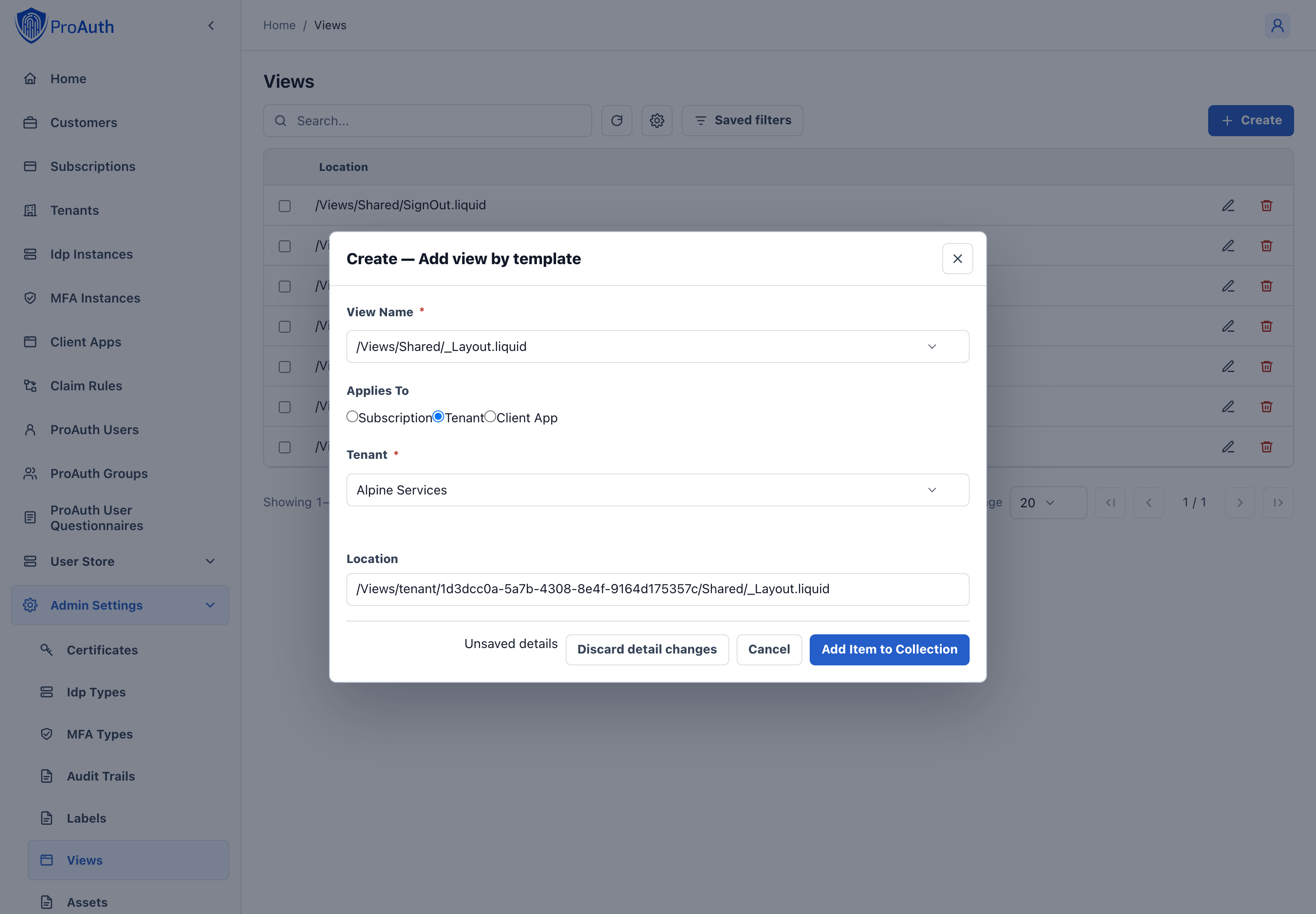
Select the template view you want to override in
View NameSelect the level to which you want to associate the view. The chosen level with the corresponding id will be part of the path.
- Subscription
- ClientApp
- Tenant
Click
Save
INFO
For each level a customized view is necessary, a custom view for this path has to be created.
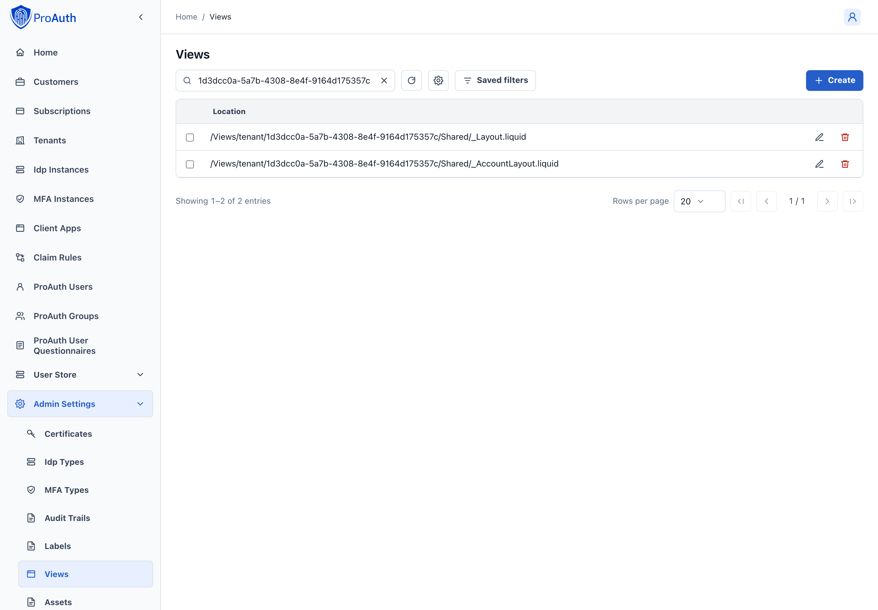
Edit custom views
After the creation of the custom view in the step before, you can now start customizing the view.
To start editing the custom view, open the custom view in the extended editor. You are now able to edit the markup in an inline editor with syntax highlighting.
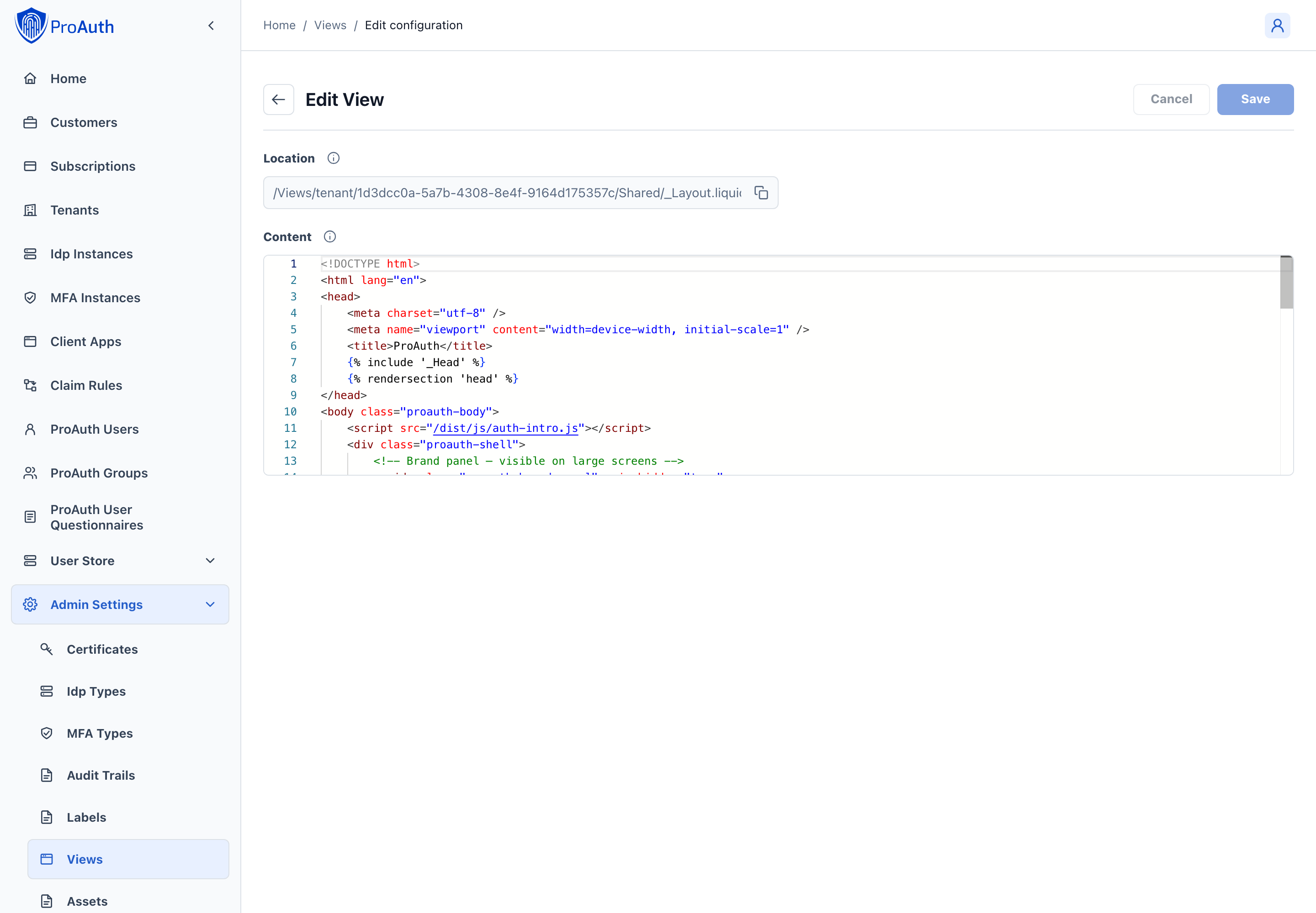
The Location field shows the relative path where this custom view overrides the template view.
Migrating from 2.x?
If you are upgrading from ProAuth 2.x (Razor views), see the Migration Guide for step-by-step instructions on converting your custom views to Fluid templates.